So, you’ve heard about the power of HR dashboards, and you’re curious about how to create one that really makes a difference.
Maybe you’re asking yourself, “Where do I even start?” or “How do I make sure it’s actually useful?” Don’t worry—I’ve got you covered. Let’s walk through this together, step by step, with plenty of examples to make it real.
Make sure to stick till the end, I have some amazing files in arsenal this time!
Things we are going to cover:
- What Exactly is the Role of an HR Dashboard?
- What Should My Dashboard Focus On?
- How Do I Ensure My Dashboard Aligns with the Leadership’s Vision?
- How Does the Company’s Overall Strategy Fit Into This?
- From Big Goals to Tangible Metrics: Bringing Your Strategy to Life.
- What Should My Dashboard Look Like? Let us go for a deep dive in making the dashboard operations easier.
- How Do I Make Sure My Dashboard Stays Relevant?
- Process to Free Data Sheets.
Let us begin!
1. What Exactly is the Role of an HR Dashboard?
You might be wondering, “Why do I need an HR dashboard in the first place?” Great question!
An HR dashboard is like your organization’s command center. It’s where you can see, at a glance, everything that’s happening with your workforce—who’s joining, who’s leaving, who’s thriving, and where there might be trouble brewing!!
Think of it this way: Instead of sifting through endless spreadsheets or waiting for reports, a dashboard gives you real-time insights.
For example, say you’re tracking employee engagement. Your dashboard can show you in seconds whether engagement scores are dipping in a particular department, which could signal deeper issues like poor management or burnout.
But it doesn’t stop there! A dashboard helps you connect the dots. If you see that high turnover is linked to departments with low engagement, you can take immediate action, like launching a targeted retention program or providing additional support to managers in those areas. This makes your dashboard more than just a report—it’s a strategic tool that drives real change.

2. What Should My Dashboard Focus On?
“Okay, I get that a dashboard is important, but what should it actually include?” you are asking good question today!
The answer lies in understanding your goals. What do you want to achieve with this dashboard?
This is the most important step, and it all depends on what’s crucial for your organization right now.
Let’s say your company is launching a new product line, and success hinges on having the right talent in place. Your dashboard should spotlight metrics like:
– Time-to-hire: Are you filling key roles quickly enough to support the product launch?
– Training completion rates: Are employees equipped with the knowledge they need to sell or support the new product?
– Internal mobility: Are you promoting the right people into roles critical for this new venture?
On the other hand, if your company is going through a merger, you might focus on:
– Cultural integration: How are engagement scores changing in the newly merged teams?
– Attrition rates: Are key employees leaving, and if so, from which departments?
– Leadership effectiveness: Are new leaders emerging, and how are they performing in this new landscape?
So, the first thing to do? Sit down and ask yourself, “What are we trying to achieve with this dashboard?”
Nail this down, and everything else will start to fall into place.

3. How Do I Ensure My Dashboard Aligns with the Leadership’s Vision?
Now, you might be thinking, “How do I make sure this dashboard is actually useful to the people at the top?”
This is where strategic planning comes into play. Before you start building anything, it’s essential to have some heart-to-heart discussions with your leadership team.
Let’s say your leadership team is focused on expanding into international markets. Your dashboard needs to reflect that strategy. Ask them questions like:
– What are the biggest challenges we’re facing as we expand internationally?
– How can HR help support this expansion?
– Which metrics would give you the most confidence that we’re on track?
From these conversations, you might discover that one of the key concerns is talent acquisition in new regions. So, your dashboard might include:
– Recruitment pipeline: How many candidates do you have in the pipeline for each critical role?
– Local talent availability: Are you sourcing locally, and how does the talent pool compare to your needs?
– Time-to-productivity: How quickly are new hires in these regions becoming productive?
By aligning your dashboard with leadership’s vision, you’re not just reporting data—you’re providing insights that help steer the company toward its goals.
Now, even if I know, that time to productivity is very important, How in the world would I get that on a working dashboard? Stick to the end, everything will be answered, we will take it up in the designing part of the article.
4. How Does the Company’s Overall Strategy Fit Into This?
“Wait, so how do I connect the dots between HR and the company’s broader goals?” Great question!
Your HR dashboard shouldn’t just exist in isolation. It needs to be a strategic tool that aligns with your organization’s goals.
For example, if your company’s goal is to become a leader in customer satisfaction, HR plays a crucial role in that strategy. Your dashboard might include metrics like:
– Employee training: Are customer-facing employees receiving the training they need to deliver excellent service?
– Employee engagement: Engaged employees are more likely to provide better customer service, so tracking engagement becomes key.
– Customer feedback linked to HR metrics: Are there correlations between high-performing teams and customer satisfaction scores?
Or, if the company’s goal is innovation, your HR dashboard might track:
– Diversity in hiring: Diverse teams are often more innovative, so tracking diversity metrics can be crucial.
– Training and development: Are you providing employees with opportunities to learn new skills and think creatively?
– Internal promotions: Are you promoting individuals who have a track record of innovative thinking?
By tying HR metrics directly to the company’s goals, you ensure your dashboard isn’t just a report—it’s a roadmap to success.
5. From Big Goals to Tangible Metrics: Bringing Your Strategy to Life
Let’s bring this to life with another example.
Suppose your company’s top priority is to increase market share by 20% in the next two years. What does that mean for HR? It means you need to ensure you have the right people in the right places to support that growth.

Here’s how that goal cascades into your dashboard:
– Talent Acquisition(Hiring TAT): Track how quickly you’re filling key roles in high-growth areas.
– Employee Training(L&D ROI): Monitor the effectiveness of training initiatives in preparing your workforce for new challenges.
– Internal Mobility: Measure the movement of talent within the organization to ensure you’re promoting/moving the right people to the right positions, creating high-value teams positioned for growth.
– Employee Engagement: Keep an eye on how engaged employees are, especially those working on critical projects.
Another scenario: Imagine your company is committed to reducing its carbon footprint as part of a broader sustainability strategy. How does HR contribute to this? Your dashboard might track:
– Remote work adoption: Are you supporting remote work to reduce commuting and its environmental impact?
– Green skills development: Are you equipping employees with the skills needed for sustainable business practices?
By aligning these metrics with your company’s strategic goals, your dashboard becomes a powerful tool for driving action and measuring progress.

6. What Should My Dashboard Look Like?
By now, you might be asking, “This all sounds great, but what should my dashboard actually look like?” The design is where the magic happens—but it’s also where things can get tricky. Whether you use Excel, Tableau, or Power BI depends on your needs and comfort level.
Let’s break it down with some examples:
– Excel: If you’re just starting or your data isn’t too complex, Excel can be your best friend. It’s perfect for creating straightforward dashboards that provide quick insights. For example, you can set up simple pivot tables to track recruitment metrics or use conditional formatting to highlight high attrition rates.
– Tableau: If your dashboard needs to be visually stunning and you want users to interact with the data (like drilling down into specifics), Tableau is ideal. Imagine using Tableau to create an interactive map showing employee distribution by region, with color coding to indicate engagement levels.
– Power BI: If you’re working in a Microsoft ecosystem and need robust analytics with strong data integration, Power BI offers the best of both worlds. You could use Power BI to pull data from multiple sources—like HR systems, surveys, and financial reports—and display it all in one cohesive dashboard that updates in real-time.
Let us go for a deep dive in making the dashboard operations easier
You might be thinking, “This sounds like a lot of work—how do I make sure the dashboard-building process is smooth and efficient?” The answer is simple: preparation.
Before you start designing your dashboard, there’s one more task that will make your life a whole lot easier—creating a data sheet. Think of this as your roadmap. It’s the blueprint that will guide you through the dashboard creation process, ensuring that you have all the information you need in one place. Trust me, investing a little time in this step will save you a ton of headaches later on.
What’s a Data Sheet and Why Do You Need It?
You might be asking, “Why bother with a data sheet? Can’t I just jump straight into building the dashboard?”
Sure, you could. But without a datasheet, you might find yourself scrambling to find data points or, worse, realizing halfway through that you’re missing a critical piece of information.
A datasheet is where you list out all the metrics you want to include in your dashboard, along with important details like:
– Which data points are required for each metric
– Where to source these data points from
– How you’ll visualize the data
– The formula or logic behind each metric
This step ensures that when you sit down to build your dashboard, you’re not searching for data or trying to remember how you planned to calculate a specific metric. Everything you need will be at your fingertips.
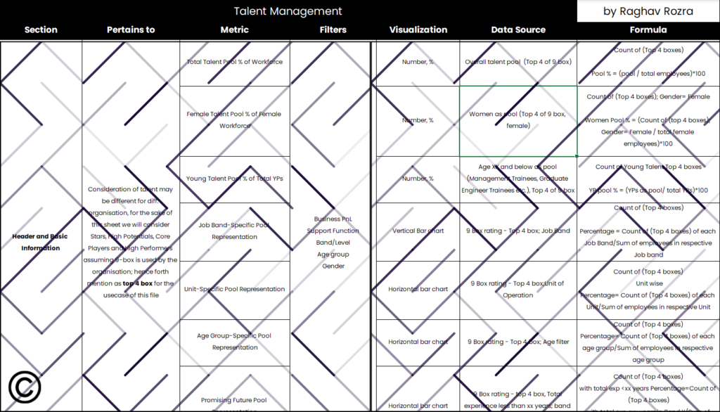
How to Create Your Data Sheet: Step by Step
Let’s break it down with an example. Suppose one of your key metrics is Employee Turnover Rate. Here’s how you’d lay it out in your datasheet:
– Metric: Employee Turnover Rate
– Pertains to: All Employees
– Details: This metric shows the percentage of employees who have left the organization during a specific period.
– Required Data Points:
– Number of employees at the beginning of the period
– Number of employees at the end of the period
– Number of employees who left during the period
– Data Sources:
– HRIS (Human Resource Information System) for employee numbers
– Exit interviews or termination records for those who left
– Visualization: A line chart showing turnover trends over time, or a bar chart comparing turnover rates across departments.
– Formula: Turnover Rate


Here’s another example of Employee Engagement Scores:
– Metric: Employee Engagement Scores
– Details: This metric tracks overall employee engagement and is usually derived from survey data.
– Required Data Points:
– Survey responses on engagement-related questions
– Number of respondents
– Data Sources:
– Employee engagement surveys conducted quarterly or annually
– Visualization: A heatmap showing engagement scores across different departments, or a trend line showing changes in engagement over time.
– Formula: The average of all engagement survey scores.
By organizing your data sheet this way, you can easily move from concept to execution without any last-minute scrambling.
What’s Next? Building the Dashboard with Confidence
Now that you’ve got your data sheet ready, the actual process of building the dashboard becomes a lot simpler. You’ll know exactly which data points to pull, how to structure your visualizations, and what calculations need to be done. With your data sheet as your guide, you’ll be able to focus on making your dashboard as insightful and impactful as possible.
7. How Do I Make Sure My Dashboard Stays Relevant?
Lastly, you might be thinking, “Once I’ve built the dashboard, is that it?” Not quite. A good dashboard is a living, breathing tool. It needs to evolve as your organization’s needs change.
Let’s say your company shifts its focus from growth to operational efficiency. Your dashboard should evolve to reflect that shift, perhaps adding metrics like:
– Cost-per-hire: Are you optimizing recruitment costs?
– Time-to-productivity: How quickly are new hires becoming effective in their roles?
– Employee utilization rates: Are you maximizing the potential of your workforce?
Or, if a new regulatory requirement comes into play, you might need to add compliance metrics, such as:
– Training compliance rates: Are employees up-to-date with required certifications?
– Policy adherence: Are there areas where non-compliance is becoming an issue?
After you’ve built it, test it with your key stakeholders. Gather their feedback, tweak what needs tweaking, and keep an eye on how well it’s working. Make adjustments as your company’s goals shift, or as you find new ways to leverage the data.
Remember, your dashboard isn’t just a one-time project—it’s an ongoing resource that should grow and adapt alongside your organization.


8. Ready to Start? Let’s Share Resources
If you’re ready to take the plunge and start building your own HR dashboard, I’m here to help! I’ve got templates for the data sheet that you can use as a starting point. Share your email to submission@hrtoday.in with your name, designation, mobile number and organization name, and HR TODAY Team will share the template with you directly. Don’t forget to mention in the subject line “HR DASHBOARD.”
By taking the time to prepare a datasheet, you’re setting yourself up for success. Building a dashboard doesn’t have to be overwhelming—it’s all about having the right tools and resources in place.
So, what are you waiting for? Let’s get started on creating a dashboard that will drive real results for your organization. Comment below to get your hands on the data sheets and start building with confidence!